In the film, I know I needed to have a magazine filled with what was right and wrong for the viewer and I wanted the name of the film to be the tile on a magazine. so I stared to create a cover for a magazine using cut outs but I couldn’t found the right sized for the tile. So to avoid lost of time, I decided to use photoshop to create the magazine cover, I looked at the ironic magazine of all times and took a letter from that magazine because without these ironic magazine’s I wouldn’t have a film. As magazine is one of the reason why people what to change themselves. so it in my best interest to do the same for my character.


Although, I didn’t know what to put on my font character because if I had a cartoon character how does it relate to the celebrities who are human. After a long thought I decided to have my own image on the font cover because I had no other choice but I can change my imagine to something i’m not. What I mean have my face with something else like a celebrity or a perfect self.
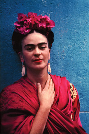
After putting background, tile and my image together it look like a good magazine cover but it wasn’t eye catching. Although, I looked at my edited self and somehow it pop up a artist called Frida Kahlo. I don’t know why maybe it was the bright lips that reminded me of her but it wasn’t her paintings or her style that reminded me of her but it was her ironic look of her which are flowers and unibrow.
However, I couldn’t add the unibrow because it wasn’t me, but I could add her flowers. As they were filled with beauty and nature.
After adding the flowers, I nearly completed the cover, I just need to add the other perfect side of my face. When I was about to create the image, I had a idea to do a simple feature of the side face, like a simple drawing of the side face. So after experimenting with Photoshop painting tools, I had a big eye with marks across the cheek relating to makeup. I got to say it look kinda cool because it looked very unique and arty, which overlook the other side of the face, the natural face. I was actually impressed by the outcome of the cover because I’m not a expert at photoshop, I just know the simple basic of it, but I created a bold and creative magazine cover which I like and is perfect for the film. Although, I could pick which kind of tile I should have because I couldn’t see if the image was overriding the tile or if the tile was overriding the image. So I asked my sister because she was the only person who was available to pick one and why, she picked the white Tile because it was easier to read. Which I agreed with but somehow I wanted her to pick the color tile because if she was like me her eyes would go to the image of the person then tile, But she is the viewer and they know best.


However, I printed out both of the covers to see which one looked better with the character and the background. I tired both covers with the character and I felt the colourful tile was the right choice for the film because I feel the audience would see the colourful letters instead of plain words.
